
Introduction to Pink App Icons
In recent years, the aesthetic of digital devices has become an essential aspect of personal expression. Among the various trends, pink app icons have gained immense popularity, becoming a staple for users looking to enhance their digital experience. This article delves deep into the world of pink app icons, exploring their appeal, design strategies, implementation techniques, marketing methods, and more.
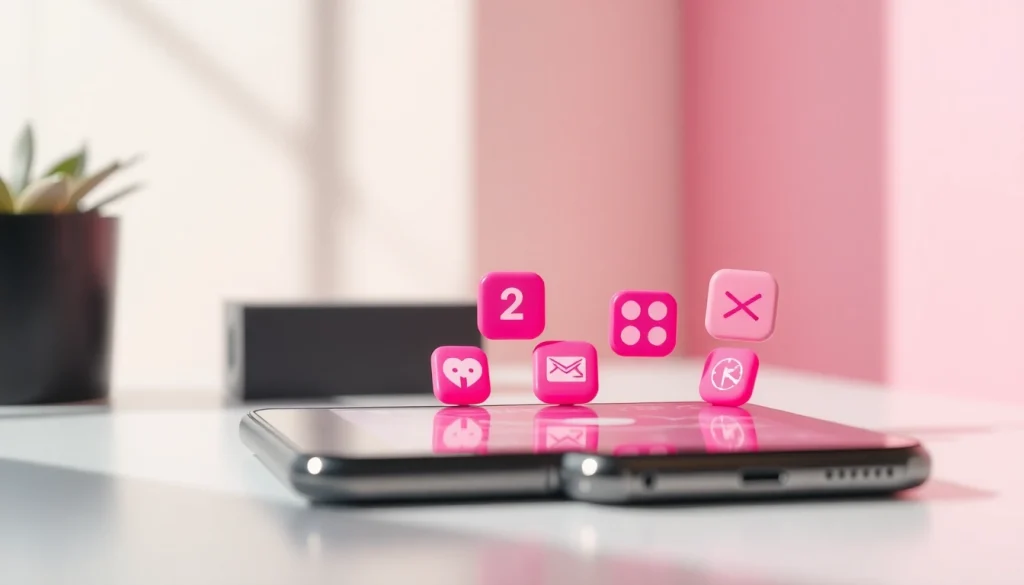
What Are Pink App Icons?
Pink app icons are graphical representations of applications that feature shades of pink in their design. They are commonly used across various platforms, including iOS and Android devices, offering a soft and inviting aesthetic that appeals to users who wish to curate a personalized visual environment. The icons can range from simple designs that are purely monochromatic to intricate, textured looks that provide depth and character.
Why Choose Pink App Icons?
The decision to use pink app icons can stem from multiple factors. For many, pink is a color associated with femininity, gentleness, and warmth, making it an attractive choice for personal devices. Additionally, pink can invoke feelings of love, compassion, and harmony, creating a positive space for users. Furthermore, choosing a color scheme that resonates with personal identity and preferences can enhance user satisfaction and emotional connection to the device.
Benefits of Using Pink App Icons
There are numerous advantages to employing pink app icons on your devices. Firstly, these icons can significantly improve the visual coherence of your home screen. Secondly, they can provide an uplifting and cheerful ambiance, positively impacting the user’s mood throughout the day. Finally, by customizing app icons, users can express their individuality and creativity, setting their devices apart from default configurations.
Designing Pink App Icons
Color Psychology in App Design
Understanding color psychology is crucial when designing app icons, as colors can influence perception and behavior. Pink, being associated with calmness and openness, tends to have a soothing effect on users. When incorporated into app icon design, it can evoke an instant sense of warmth and friendliness. Designers must consider the target audience and the message they want to convey, selecting shades that align with both the app’s function and the emotions they wish to evoke.
Creating Cohesive Branding
Cohesion in design is critical for branding. Pink app icons can be a powerful tool for brands looking to establish a visual identity. When creating a custom icon set, the chosen shades of pink should complement the brand’s overall palette and messaging. Moreover, consistency across different platforms enhances brand recognition, leading to a stronger connection with users. A well-defined branding strategy that incorporates pink app icons can help communicate the brand’s values and personality effectively.
Design Tools for Custom Icons
There are various design tools available to create stunning pink app icons. Software like Adobe Illustrator and Photoshop offers extensive capabilities for designing detailed and unique icons. For those who prefer simpler options, applications such as Canva and Procreate provide user-friendly interfaces that are ideal for beginners. Using these tools, designers can explore various styles, textures, and shapes to develop pink icons that truly speak to their audience’s tastes.
Implementing Pink App Icons
How to Install Pink App Icons
Installing pink app icons depends on the device’s operating system. For iOS users, the process involves using apps like Shortcuts to create custom icons linked to original applications. For Android users, many launchers allow for icon customization, enabling users to change icons easily from within the settings. Understanding the installation process ensures that users can take full advantage of the aesthetic appeal of pink app icons.
Customizing Your Device’s Theme
Beyond just changing individual icons, users can create a corresponding theme to enhance the overall look of their device. This can include selecting wallpapers, widget designs, and other UI elements that harmonize with pink app icons. By ensuring all elements share a common color scheme or visual style, users can achieve a more cohesive and professional appearance across their devices.
Best Practices for Icon Use
To maximize the utility and appeal of pink app icons, users should follow best practices. Ensuring clarity in the design is paramount, as icons should be easily recognisable, even at a small scale. Balance is also essential, as too much visual clutter can detract from the overall aesthetic. Lastly, regularly updating icons to keep in line with personal preferences can help maintain an engaging and fresh interface.
Promoting Your Pink App Icons
Marketing Your Icon Packs
For designers looking to sell pink app icon packs, effective marketing strategies are crucial. Creating visually appealing presentations, utilizing compelling descriptions, and showcasing user testimonials can enhance visibility. Additionally, hosting giveaways and offering free samples can garner initial interest and draw potential customers in.
Leveraging Social Media for Exposure
Social media platforms provide powerful avenues for promoting pink app icons. Utilizing visually-driven platforms like Instagram and Pinterest can highlight the aesthetic appeal of icon designs. Engaging with audiences through regular posts, stories, and interactive content can help build a community around the icon packs, leading to increased brand recognition and sales.
Collaborations with Designers
Collaborating with fellow designers can amplify marketing efforts. Joint projects can lead to cross-promotion, exposing each designer’s work to a broader audience. Furthermore, partnerships can spark new creative ideas, resulting in unique products that combine different design philosophies and styles while staying true to the essence of pink app icons.
Frequently Asked Questions
How can I use pink app icons on my smartphone?
To use pink app icons, you can download icon packs and install them through your device’s settings or a launcher app. Explore icon customization tools for better results.
Are there free resources for custom pink app icons?
Yes, various websites offer free icon packs, or you can create your own using free design software like Canva or GIMP. This empowers you to craft personalized icons.
What design tools are best for creating app icons?
Popular design tools include Adobe Illustrator for advanced designs and Canva for simple, user-friendly options. Both tools are effective for creating stunning pink app icons.
How can pink app icons enhance user engagement?
Pink app icons create visually appealing interfaces, which can enhance user satisfaction and encourage more prolonged interaction with the app, leading to increased engagement.
Is color psychology important in app design?
Absolutely! Color psychology shapes how users perceive and interact with apps. Pink can evoke warmth and positivity, enhancing overall user experience and satisfaction.